
It is often more exciting to start with the design of a website than thinking about its content structure. The experience is obviously about the visuals, but also about the way the user interacts with your interface. This is why it is very important to think about usability before design. A “quote” you can keep in mind could be: “Design serves usability and not the other way around”.
The usability takes place in the conceptualisation phase of a project. It should allow you to establish the basis of interactions that drives your application. Many paths are possible for a user, but which one is the clearest and most efficient? This article will allow you to know a little more about some best practices to adopt.
Prerequisites
No pre-requisites are necessary to follow the content of this article. However, if you want to start conceptualising your project now, here are some tools that may help you:
- A felt-tip pen, pencil, post-it notes, a board or simply a blank wall. Many companies in the field of new technologies dematerialise their conceptualisation and many organisational techniques are then possible depending on your project.
- The other option is also to use a graphic creation software: Axure, Balsamic, Figma, Sketch, among others…
Many articles on the web will tell you that the number of clicks a user must make to access the desired content must be equal or less than 3. If not, this would mean that the structure of your site is bad. That may be true in some way… You obviously don’t want your customer to click a hundred time to reach your checkout page. However it bring the question of what can actually be considered a click: a button, a drop down menu, a contact form, confirmation of data policies, zooming on an image, etc… If we take the example of a form, this three-click rule hardly applies and yet no one seems to have troubles registering on any social media platform. This theory is good to keep in mind, not as a strict 3 clicks/tap rules but the essential rules to remember in my opinion would be the following:
- Reduce the overall number of user actions (clicking, tapping, scrolling, inserting data, reading, understanding the interface, etc.) to reach a certain goal.
- Avoid unnecessary elements that cluster the page and distract the user (e.g. random popups, too many links on your page or in your navigation)
- Make any action unambiguous (e.g. a shopping cart/basket for sideways purchases, a form with a description of each field to be filled in – “placeholder”).
Navigations and Buttons must be cristal clear
Many artists and designers believe that each piece of work should be unique and unprecedented. But why reinvent the wheel? Does your user have to learn your interface before they can interact with it? Ideally not. That’s why it’s best to be clear about the positioning and style of the navigation and all your buttons.
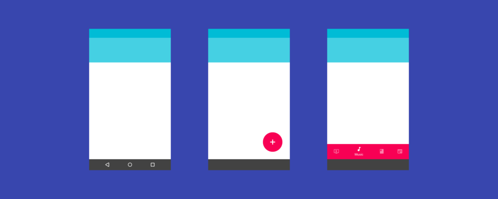
The main navigation is usually located at the top of the screen. It is also often symbolised by a column aligned to the left or right of the window.
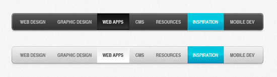
Even mobile navigation has its own standards nowadays: a navigation bar at the bottom and/or top of the screen.
Buttons, interactions and actions must be instantly understood by the user. Animations can help you to illustrate different states in the same space.
Pay attention to proportions!
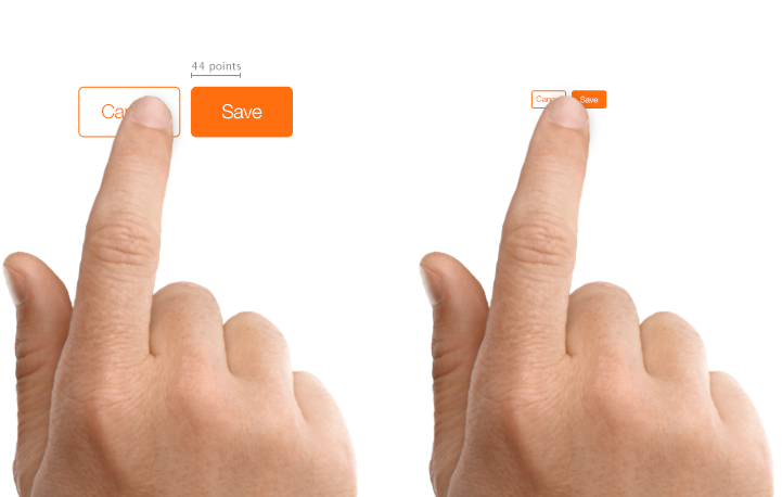
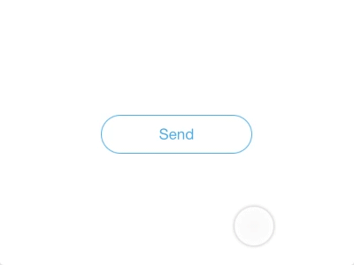
Buttons that are too small will never be understood as such. One of the basic rules is to have a minimum size of 50 x 50px actionable area. In addition, the text included must be clear and (in the best case) be composed as follows: verb/action + item/target if additional informations are required for complexe actions.
Respect the zoning and positioning standards
Following the same model as the previous section, it is often not advisable to position your elements randomly or simply according to your personal taste. If the user has to spend 5 minutes to realise where your main navigation is, or can’t find an information they are looking for, then there is a strong chance that they will leave your site to look elsewhere. Being in a re-assuring and well known environment will increase your customer retention. This implies a lot for new customers.
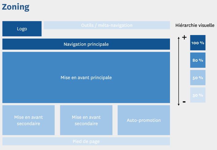
Therefore, favour standard positioning and proportions to avoid any confusion. The hierarchy of your elements here will be based on the positioning on the page. The information at the top of the page will have a better chance of being seen than your footer. This factor must be taken into account when prioritising your content (text and media).
Define a content hierarchy structure
When it comes to the content of your application, it is important to define a structure and guidelines on how to organize your information. Most users will not necessarily read the whole text, they will scan the important areas and find the item they are looking for by keywords. That’s why your headings, subheadings, images… should be contrasted and include important terms from your topic.
h1.headline
h2.subheadline 1
h3.subheadline 2
h4.subheadline 3
p.paragraph
Keep your design consistent
This part could totally materialise in a full article, but here are some tips that may help you when conceptualising your project.
As we saw earlier, many usability topics are related to how the user will “learn” your interface. A good user experience combines simple graphical elements that serve a purpose that is not always simple. This is why you need to keep constant artistic choices in order to reassure your users and build a solid brand identity.
Here are some tips that will allow you to keep the ergonomics and design consistent:
- Do not change the zooning across different pages. Example for desktop websites: the navigation is always at the top of the page and the footer is always at the bottom; keep the proposals similar across all your pages; keep a consistant number of columns on all your pages.
- Define a primary, secondary and functional button and do not change them along the way (or you will have to change them all).
- Do not use too many different fonts (3 maximum), one can be enough if it is rich enough (composed of sub-families such as: regular, medium, bold, extrabold, italic, condensed, …)
Test your interface
It is sometimes difficult to keep a distance on what you are doing. Having a neutral eye while being fully invested in a project is quite complicated to combine. It’s in these moments that you lose objectivity and mistakes can be made.
Something that may seem obvious to you may not be obvious to everyone. Think about your target audience (age, gender, social class, technology friendly) as some types of users may not understand the purpose of your service. Ensuring good usability also means being able to test your interface to validate or refute certain features of an application. To do so, I’m personally in favour of qualitative research, meaning that I interview one person at a time and I make sure the user test scenario is well structured to find the desired outcomes. The meeting can obviously be in real life, or through Skype (Camtasia, Google Hangout, Appear.in) where you can discuss and see the screen of your tester. Ideally, it helps a lot to see the body of the person you are interviewing: the eyes to know certain focus of attention, the face for facial expressions and the hands for gestures.
Based on a panel of user tests (minimum 5 for qualitative research) and previously defined goals, you will be able to draw conclusions on the usability of your site to ensure optimal quality of your product.