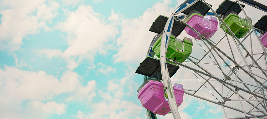
Yes! Like a Ferris wheel in an amusement park, HTML5 / CSS3 once properly structured can animate and generate a predefined (or even infinite) number of cycles. Find here the way to loop a sequence, and the knowledge to code a unique animation. Reference: CSS Tricks | W3School
Prerequisites
Basics in HTML/CSS and knowing how to estimate timing proportions will be necessary to create your awesome animation. Through this case study you will find key concepts to generate different types of HTML5/CSS3 animations. Before starting you will have to create an index.html and style.css files.
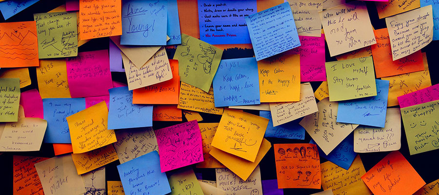
Most commun case of the button states animations
Maybe you’ve already seen button/link animations all over the web. Often more sober than the following example, this type of animation is a real artistic plus to your project. So here you’ll find transitions on :hover, :active, :focus states – the most likely cases you might encounter when developing your website.
This example considers <“a”> link tags, but be aware that it is possible to embed them in any HTML5 semantic tag type: div, section, nav, ul, li, etc… All of these examples will work in the same way.
Here is the code related to the previous example. See the very minimal HTML sequence that can fit into your index.html.
<div>
  <a id="link1" href="#">
    HOVER
  </a>
  <a id="link2" href="#">
    ACTIVE
  </a>
  <a id="link3" href="#">
    FOCUS
  </a>
</div>
/*** Default section ***/
div{
width: 100%;
margin: 0 auto;
padding-top: 40px;
font-family: Helvetica, Arial, sans-serif;
text-decoration: none;
}
/*** Set link <a> properties ***/
div a {
max-width: 300px;
display: block;
margin: 0 auto;
margin-top: 20px;
padding: 10px 0px;
background: green;
color: white;
text-align: center;
text-decoration: none;
border-radius: 20px;
/* Add transition property */
transition: 0.5s linear;
}
/*** TRANSITIONS ***/
/* Once mouse is on link */
div a#link1:hover {background:blue;}
/* Once click/tap is active, stay on
until the release */
div a#link2:active {background:red;}
/* Once the element is clicked one time - loose effect when the user click somewhere else on the page */
div a#link3:focus {background:orange;}
/* Once you already clicked the link before hand */
/*div a:visited {background:purple;}*/ and here is the CSS with the details of the functions in the comments. For information on the indentation of the code, it is often advised to keep the same logic on line breaks and the overall way to comment your code. This type of consensus rules applies for a teams of developers but if you are alone, some well known standard can be applied to make your code readable to others.
Integrating loops using KeyFrames
In this example, we have a set of animated interactions/transitions on a loop here: colours, positions, rotations and shading. These give a 3D effect to the main container. You can of course feed your version with other properties like: size, scale, z-index, opacity, borders (see the article dedicated to CSS and dig into other CSS properties for your animations).
Regarding your HMTL it is very easy, there is only 2 divs to create.
<div id="tile-wrapper">
  <div id="tile"></div>
</div>
The CSS positioning of the element is done in absolute. The @keyframes defined by percentages will allow you to establish your different transition states. The proportions of the sequence follow this type of pattern: 0% beginning, 25% a quarter, 50% half, 75% three quarters and 100% the end of the animation. Considering those parameter, you can define more intervals if you wish, but also add more or less states in your transitions.
<style type="text/css">
div#tile-wrapper{
  background:rgba(0,0,0,0);
  width: 95%;
  height: 340px;
  display: block;
  overflow: none; /* Hide everything out of the body panel */
  margin: 0 auto 20px auto;
  position: relative;
overflow:hidden;
}

/* The animation code */
@keyframes AnimationName {
    0%   {
      background-color:#B4B4B4;
      left:-200px;
      transform: rotate(-2deg);
      box-shadow: 10px 8px 0px #B2B2B2;}
    50%  {
      background-color:white;
      box-shadow: 0px 16px 0px #B2B2B2;}
    100% {
      background-color:#B4B4B4;
      left:102%;
      transform: rotate(2deg);
      box-shadow: -10px 8px 0px #B2B2B2;}
}

/* The element to apply the animation to */
div#tile {
    position: absolute;
    top: 4%;
    left: 0%;
    width: 220px;
    height: 300px;
    rotation:30deg;
    border-radius: 20px;
    animation-name: AnimationName;
    animation-duration: 5s;
    animation-timing-function: linear;
    animation-iteration-count: infinite;
}
</style>