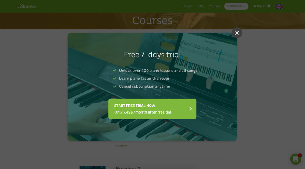
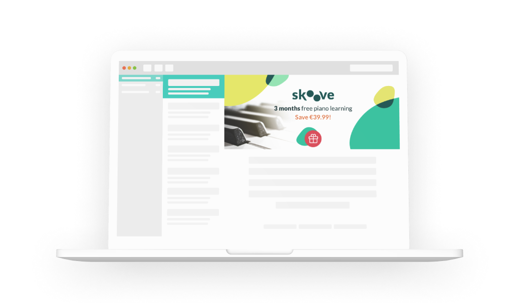
Over my experience at Skoove, one of the most important and sensitive topic I’ve been part of were definitely the offers and plans pages. The complexity is in the perception and acknowledgment of the user in front of it. Moreover, it represents the moment of the app where people will invest money-wise into your product. Consequently, a good conversion page will ensure better success for the company.
In addition to all the business impacts and considerations that must be taken into account, the actual doing part of those projects consist of having a good balance on the page, be simple and pleasant. By having clear copies, CTAs and a reduced amount of action to the user, we also observed through A/B tests that conversion rates are improved. Continuous testing is key to constant learning, by challenging new ideas (textual content or visuals) you increase your knowledge on the user behaviour.
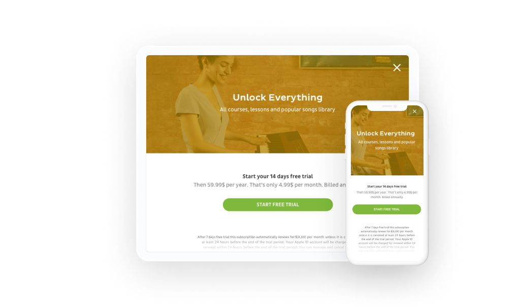
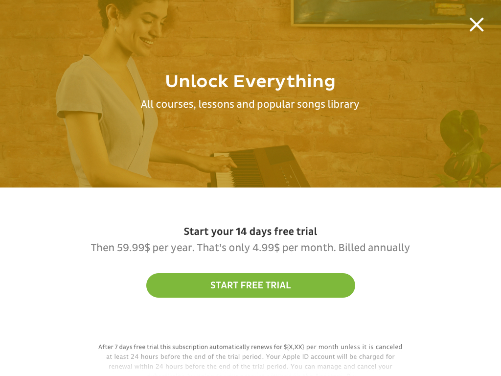
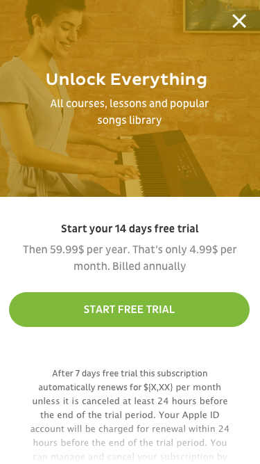
iPad and iPhone offers page (2018)
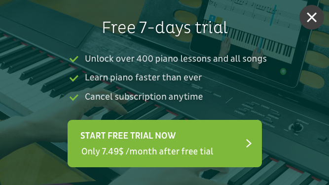
Web offers page on a desktop and phone portrait (2019)
